Montefili Wine Label Design
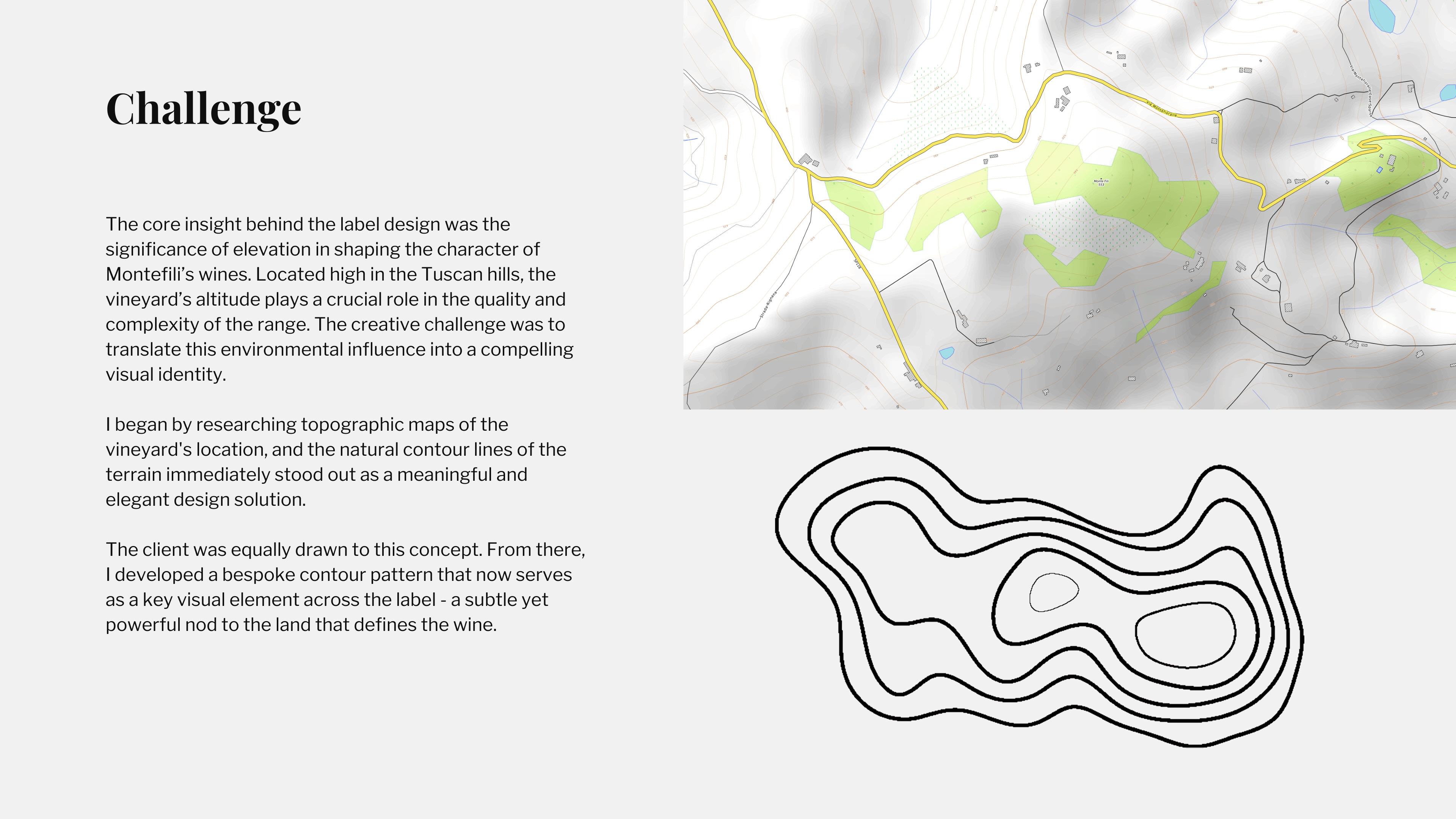
Challenge
The core insight behind the label design was the significance of elevation in shaping the character of Montefili’s wines. Located high in the Tuscan hills, the vineyard’s altitude plays a crucial role in the quality and complexity of the range. The creative challenge was to translate this environmental influence into a compelling visual identity.
Solution
I began by researching topographic maps of the vineyard's location, and the natural contour lines of the terrain immediately stood out as a meaningful and elegant design solution.
The contour pattern now extends across all three tiers of the range, creating a unified visual system rooted in the vineyard’s terrain. Each tier expresses a different level of craft and maturity, yet all remain connected through the same topographic lines that reference the land defining Montefili’s wines.
Testimonial
"Ankur brought a level of craft and sensitivity to our brand that truly impressed us. He immediately understood the heritage and character of Montefili and translated it into a label that feels modern, refined, and unmistakably ours. His attention to detail, typography, and material choices elevated the entire presentation. The final design captures the spirit of our vineyard with elegance and confidence, a standout piece of work."
-Sofia Montanari