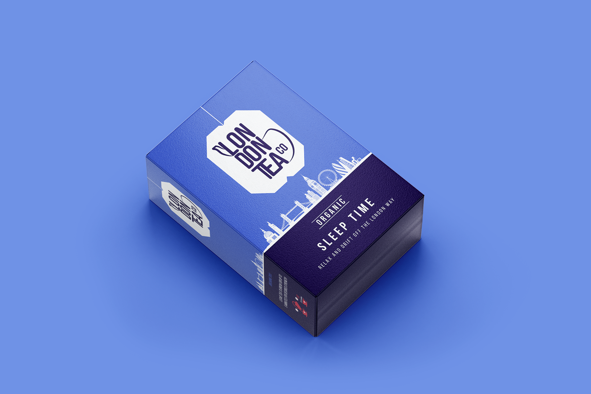
London Tea Co.
Photoshop
InDesign
Illustrator
Challenge:
The London Tea Company faced a brand identity issue; their packaging was getting lost among the noise of supermarket shelves, making brand and product recognition difficult.
The London Tea Company faced a brand identity issue; their packaging was getting lost among the noise of supermarket shelves, making brand and product recognition difficult.
Research & Exploration:
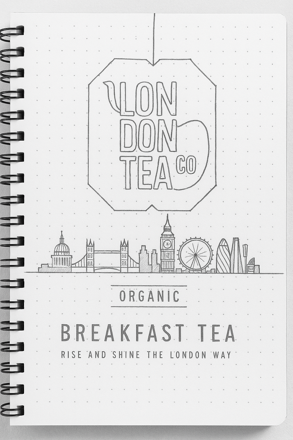
I began by looking into competitor packaging to understand shelf dynamics. My initial sketches explored structure, typography, and colour cues that could help the brand stand out.
I began by looking into competitor packaging to understand shelf dynamics. My initial sketches explored structure, typography, and colour cues that could help the brand stand out.
Concept Development:
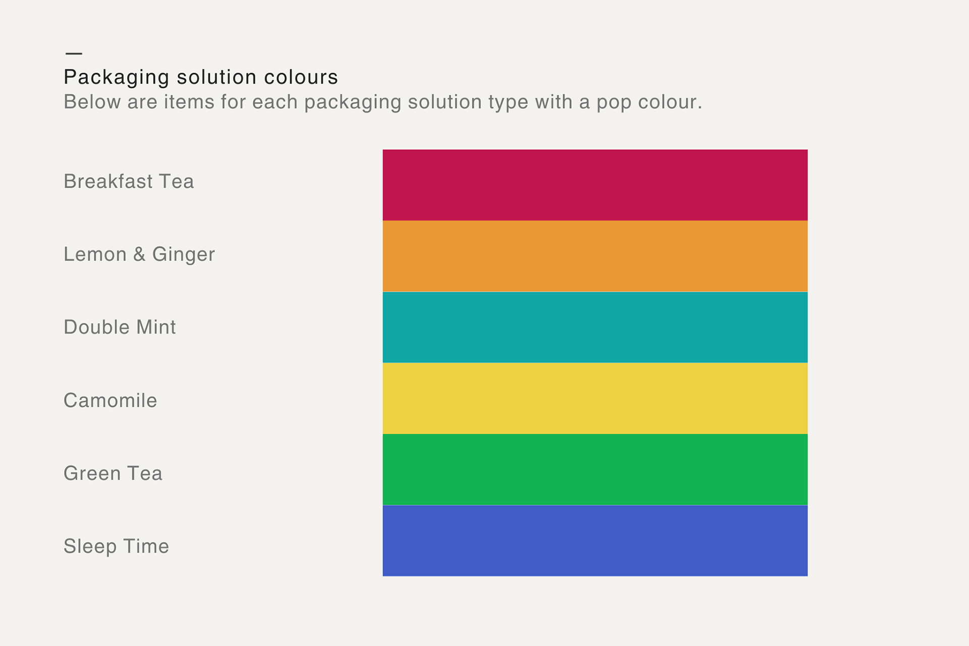
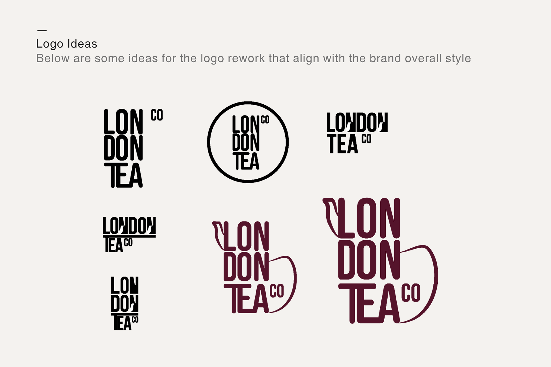
Using vibrant pop colours paired with minimalist layouts, I aimed to create strong flavour cues while keeping the design clear and memorable. I refined the logo to enhance brand recognition and legibility.
Using vibrant pop colours paired with minimalist layouts, I aimed to create strong flavour cues while keeping the design clear and memorable. I refined the logo to enhance brand recognition and legibility.
Solution:
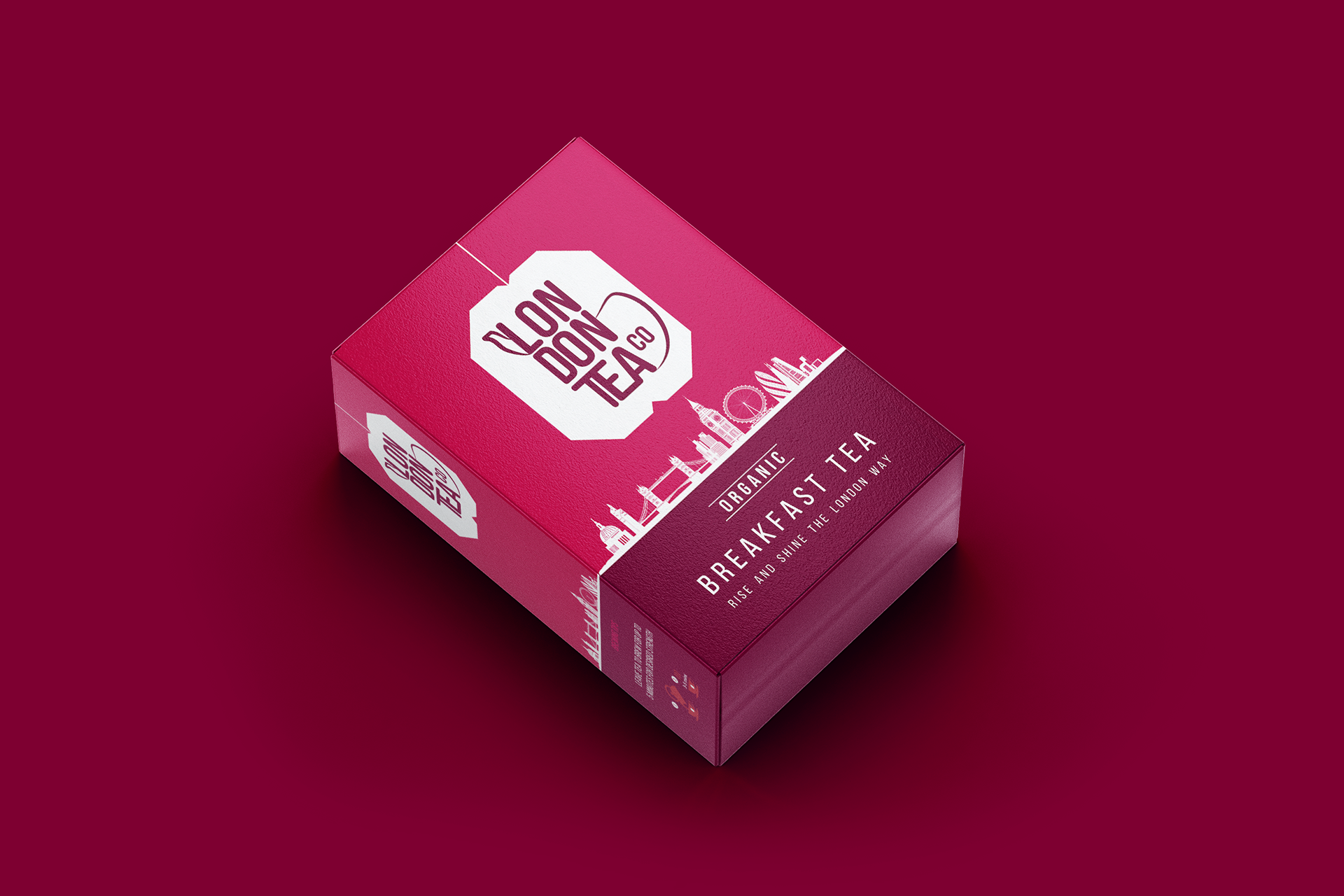
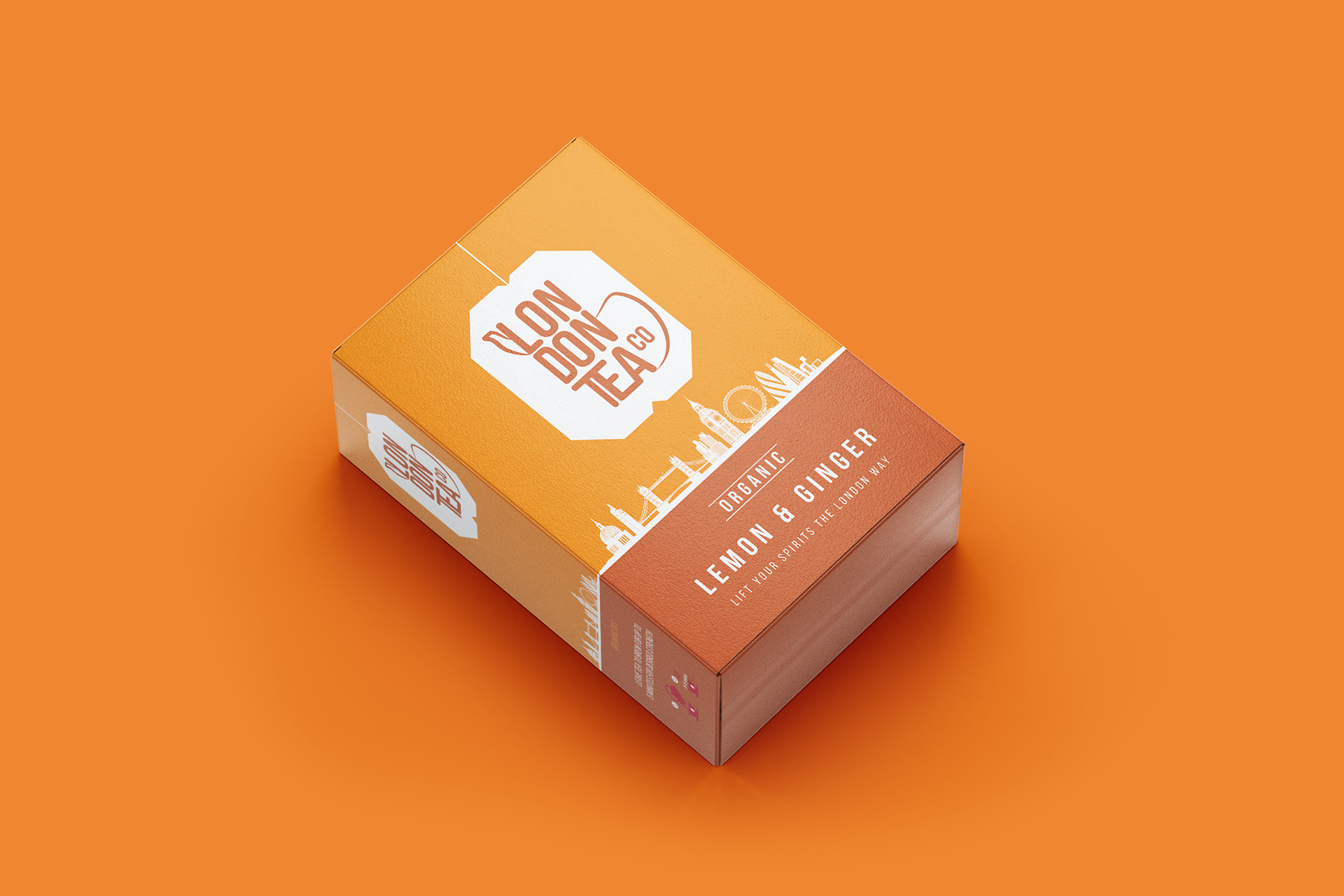
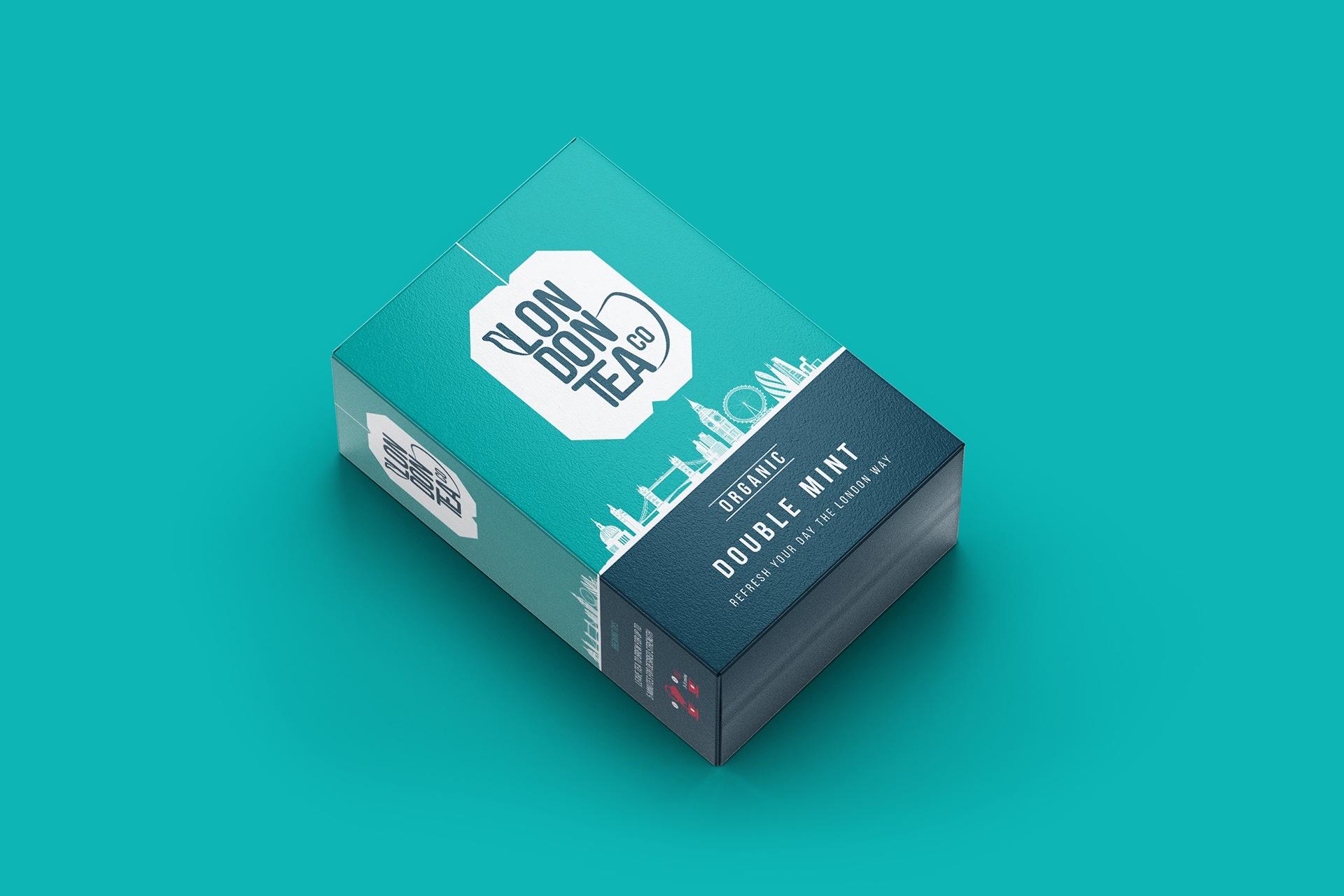
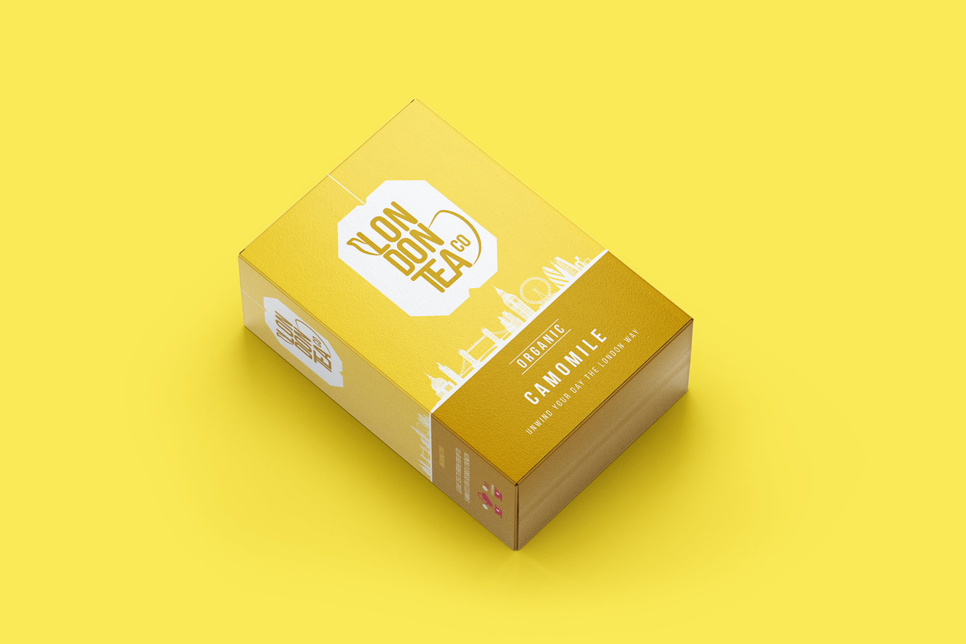
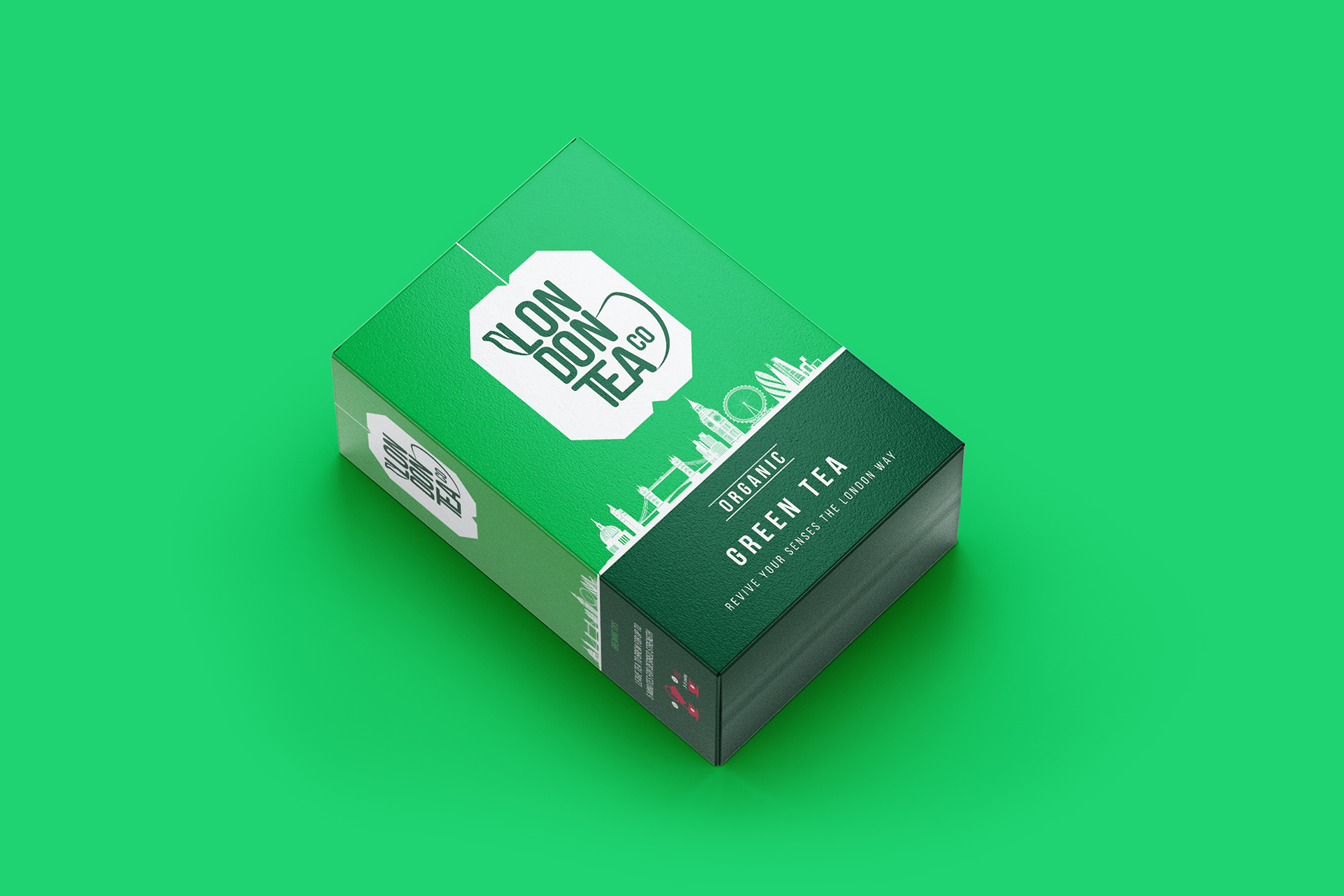
A new, stripped-back design system focused on colour as a storytelling element, ensuring each flavour stands out with bold simplicity while the logo anchors the brand consistently across variants.
A new, stripped-back design system focused on colour as a storytelling element, ensuring each flavour stands out with bold simplicity while the logo anchors the brand consistently across variants.